The Handbill Before the Hype: How Shows Found an Audience
See how a show handbill can make an event clear at a glance, helping readers understand what is on, where to go, and why it may interest them.
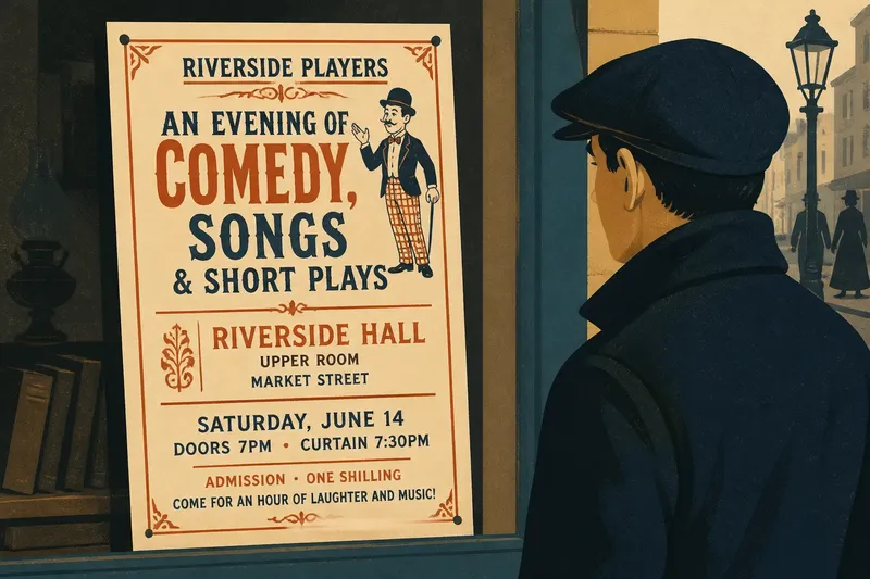
A passerby slows beside a shop window, glances at a printed handbill, and either keeps walking or turns toward the venue. A show handbill has a brief moment to explain what is happening, where it is, and why someone might want to attend.
Handbills have served different purposes in different places and periods. Depending on local custom and the event, a promoter might hand one out, post it in a window, or leave it where prospective audiences gathered. The compact format makes a publicity question clear: which facts should a reader notice first?
What should a show handbill tell a passerby?
A useful handbill answers immediate questions in a readable order. It identifies the show, gives the venue and performance time, and offers a specific reason to consider attending, such as a named performer or a description of the program.
Each detail does a different job. “A comedy” gives a broad category; a performer’s name may matter to someone who recognizes it. A venue name without a location can leave a stranger unsure where to go. A date without a time can prompt another search. Brevity helps only when it preserves the information a reader needs to act.
A large headline may catch the eye, but supporting details make the event understandable. Like a street sign, a handbill must be readable quickly. It also has to suggest something about the show’s character.
How can concise design make an event legible?
Legibility starts with hierarchy: the visual order that tells readers what to notice first, second, and third. A designer might set the show’s name prominently, group the venue and timing together, and give supporting names or admission information less emphasis. The right arrangement depends on the intended audience and where the sheet will appear.
Type size, spacing, and contrast help separate facts. A dense block of uniform lettering makes every detail compete, while short lines and clear breaks help the eye locate essentials. If decorative lettering gives the title character, plain type for practical information can balance it.
Ornament should support the message. A border or illustration may suggest a show’s tone, but visual flourishes cannot make up for a buried time or location. A handbill is like a labeled jar: decoration can catch attention, but the label still needs to say what is inside.
What can the wording promise without overexplaining?
Short copy should be specific enough to spark interest without becoming a plot summary. “Songs and comic sketches” gives a clearer idea than “an evening of entertainment.” Names, act types, or a description of the occasion can help readers decide whether the event suits them.
Say a neighborhood troupe is preparing a handbill for a mixed program in a room above a public hall. Its organizers write “Comedy, songs, and short plays” beneath the troupe’s name, then place the hall, date, and starting time together. A reader who does not know the performers can still identify the kind of evening and find the essential attendance details.
This approach shows why a handbill is not simply a smaller version of a longer advertisement. A complete participant list may matter to the company, but a first-time reader may need a clear description and practical details more. The available space should serve the reader’s decision.
How should distribution shape the message?
A handbill’s audience depends on where it appears and who is likely to see it. A notice near a venue might rely on local familiarity. One handed to a stranger on a busy street may need a fuller location. A sheet in a shop window must compete with nearby visual material; one given directly to a person has a better chance of being read, though its opening still needs to be clear.
Placement also affects how much context the wording can assume. A local name may mean something to nearby residents and little to visitors. Pairing it with a recognizable description, such as a comic performance or musical program, lets the notice make sense without relying entirely on personal knowledge.
What details make a show handbill convincing?
A convincing handbill combines an identifiable event, useful attendance information, and a reason to pay attention. Use these checks to decide what belongs and what needs revision:
- Check whether the title or description identifies the show; if it does, keep it prominent, but if it is vague, replace or supplement it with a plain description.
- Check whether the venue name and location tell an unfamiliar reader where to go; if they do, keep them together, but if not, add the missing location detail.
- Check whether both the date and starting time are clear; if they are, group them for easy scanning, but if either is missing, add it before adjusting decorative copy.
- Check whether the wording gives a concrete sense of the program; if it does, retain that phrase, but if it only says “entertainment,” name a type of act or performance.
- Check whether each performer’s name helps the likely audience recognize or choose the event; if it does, include it, but if the roster crowds out essentials, shorten the list.
- Check whether any illustration or decorative lettering leaves the title and practical details easy to read; if it does, keep the design, but if it obscures them, simplify or move the ornament.
Which information belongs at the top?
Place the show’s identity or strongest description where the eye lands first. Follow it with the venue and performance timing so a reader can understand the offer and the opportunity to attend.
How much performer information should appear?
Include names that identify the event or matter to its likely audience. If a long roster crowds out the show description or practical details, a shorter selection may communicate more clearly.
Should the design use an illustration?
An image can add character or suggest a type of performance if it remains easy to read at a glance. It should support the words rather than obscure the title, location, or timing.
What makes a handbill hard to understand?
Unclear hierarchy, vague descriptions, and missing practical details leave questions unanswered. Read the sheet as a stranger: if the essential facts do not stand out, revise the wording or layout.
What can a handbill teach about show publicity?
A handbill makes a basic publicity challenge visible: attention is brief, but a decision needs information. The format joins a reason to care with a way to act, using wording, type, and placement to connect a show with people who may not know it exists.
For anyone planning a show handbill, the useful test is whether a reader can identify the event, locate it, and understand its appeal without asking for help. When those facts are clear, supporting names and design can add character without getting in the way.